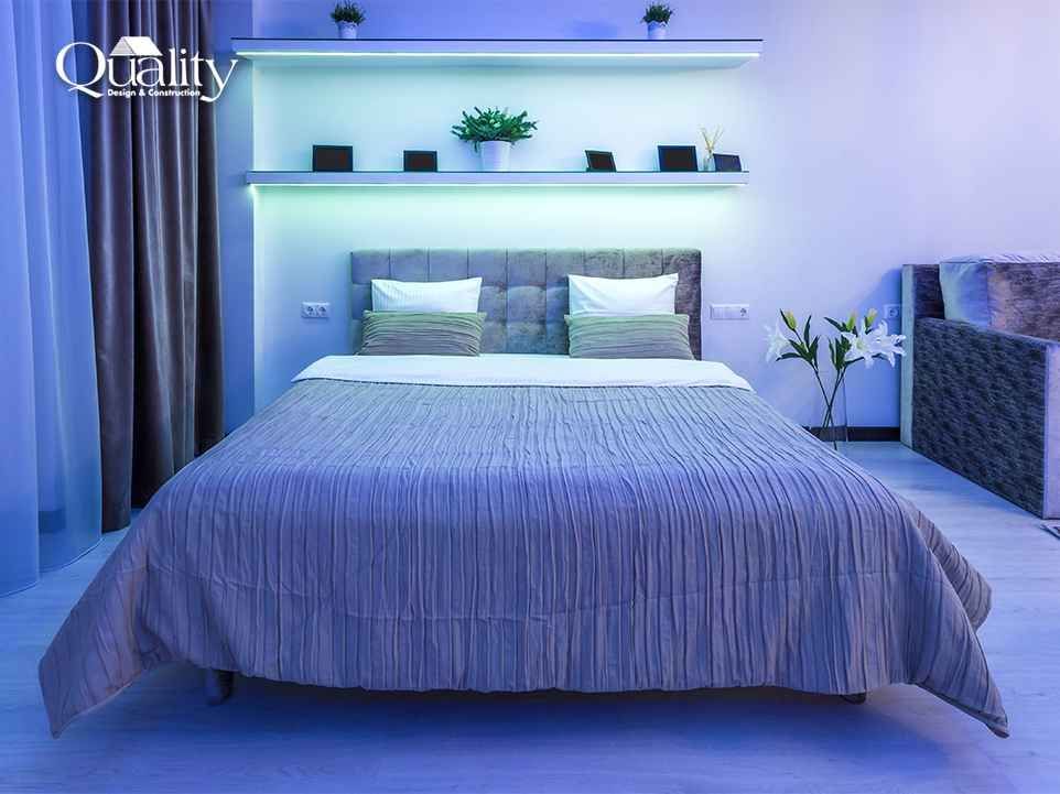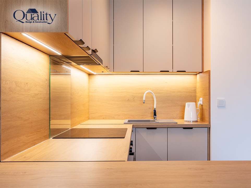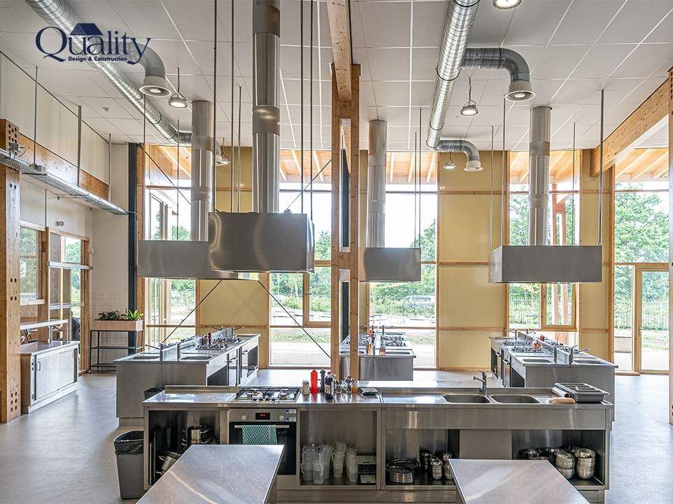
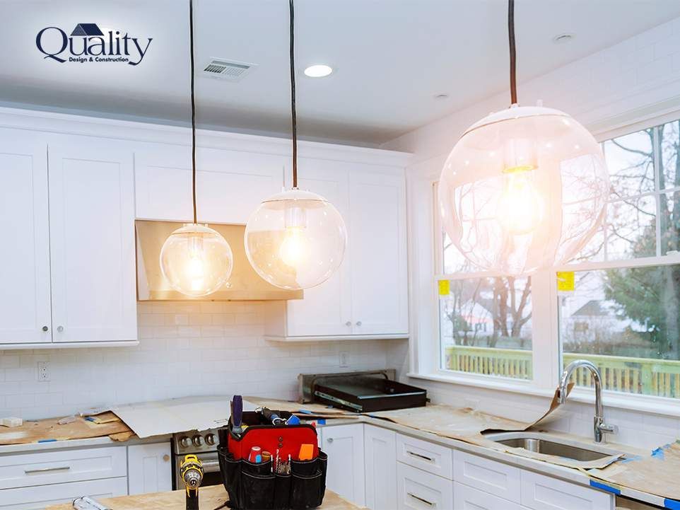
We see kitchens that were designed well, built well and finished well, and still look dull. Almost always the lighting is the reason, and more specifically the color temperature of it.
What color temperature actually changes
Warm light flatters skin and timber and makes a room feel relaxed. It also turns white cabinetry faintly yellow and mutes a cool grey stone. Cooler light reads crisp and clean and shows finishes honestly, but pushed too far it strips the warmth out of the room and makes food look unappetising.
Pick a target and stay on it
The single most common mistake is mixing temperatures in one room. Warm downlights, cooler under-cabinet strips and a different tone again in the pendants will never look intentional. Choose a target, specify every fitting to it, and check the pendant bulbs match rather than assuming.
Let the finishes decide
Cool-toned kitchens with white or grey cabinetry and stone counters generally want a neutral white. Warmer kitchens with natural timber, cherry cabinetry or brass hardware can carry something warmer without going amber.
Then add dimming
Temperature sets the character and dimming gives you range. Together they let one room be a workspace at eight in the morning and somewhere you would happily sit at nine at night.